

Define & Align
The Product Opportunity
Behind the scenes, HotStreak built unique gameplay capabilities that separated it from its competition, but they had yet to be translated into an intuitive user experience. In a landscape where users decide an app’s value within seconds of opening it, making a good first impression was key to success.
To get a broad sense of what the first impression looked like, I assessed Mixpanel analytics from our legacy app. What it exposed was a steep drop-off rate of 54% before new users ever completed registration.
Product Note on Gaming Compliance: While a high drop-off rate is standard in real-money gaming due to mandatory geofencing and KYC (Know Your Customer) identity checks, I wanted to isolate how much of this drop-off was legally inevitable versus how much was caused by preventable user experience friction.
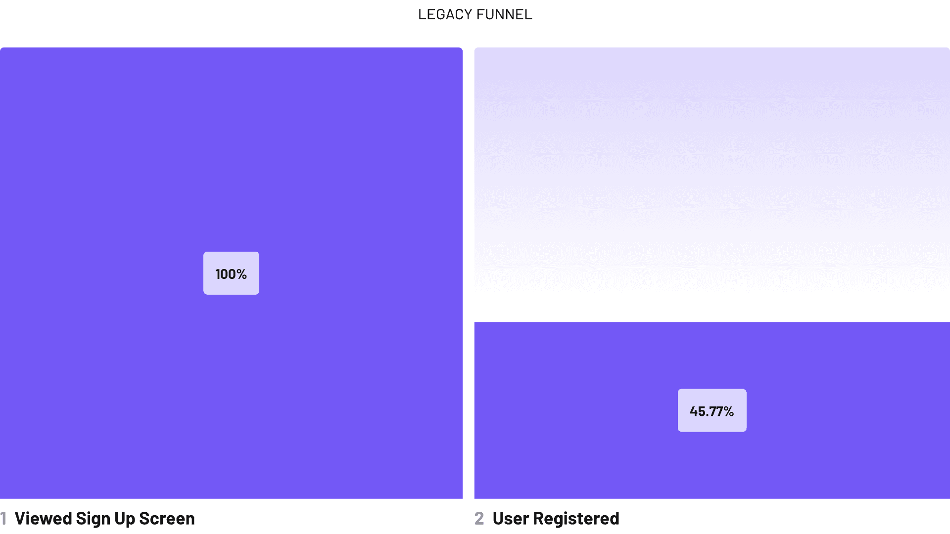
As a platform blending a real-time pick'em model with traditional sports betting features, I had to find a way to navigate rigid legal geofencing, protect proprietary live data, all while fighting top-of-funnel drop-off.
research & analyze
Uncovering Friction
I conducted formative testing and user interviews with 5+ active daily fantasy sports (DFS) users within our core demographic. My goal was to gather first impressions of the app, map real user behavior against our metrics, and uncover possible friction points blocking conversion.
I also analyzed 20+ DFS competitors and sportsbooks to see what was working and where HotStreak could stand out.
common patterns to adopt

Delayed Friction
Account setup prioritized basic credentials, with some offering a dismissible gate so users could preview a limited lobby. Deposit steps were pushed till after users were registered.

Standardized Lobby
Market leaders utilize a top sports navigation carousel paired with a dense vertical grid of player cards.
opportunities to shine

Micro Markets
Competitors lacked a unique framework for real-time play, leaving live tracking disconnected from the momentum of the game.

The Visual Edge
No competitor utilized a high-energy orange as their core brand color.

THE STRATEGY
Balancing Trust & Excitement
Based on my research, I focused on three areas to transform the user experience, while still fully respecting sports gaming regulations.
Restructuring Onboarding for Trust
I transformed our rigid registration funnel into a flexible, dual-path onboarding journey. New users can choose to sign up immediately or bypass registration to window-shop a limited lobby first. This lets us strategically defer heavy compliance steps (like location checks, identity verification, and deposits) until a user shows clear intent, like trying to build an entry.


Exposing Unique Gameplay Mechanics
I worked closely with our lead developer to understand HotStreak’s technical scope and live-tracking constraints. Together, we mapped out dynamic layouts that could mirror the fast-paced excitement of live game states across NBA, MLB, and NFL, leveraging familiar mental models (like a basketball court or baseball diamond) to make real-time data immediately intuitive.

Revamping the Visual Brand for Excitement
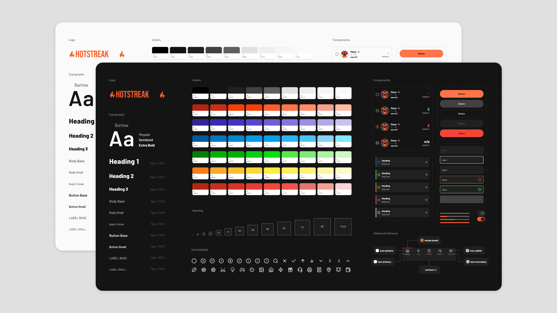
I revamped HotStreak's brand and built a lean, fully accessible design system driven by a high-energy palette and typography that could support light and dark modes.
To see how I did this, check out my HotStreak Design System Case Study.
Testing & iteration
Refining Designs
I conducted usability testing and targeted surveys, specifically focused on the new onboarding flow, as mitigating top-of-funnel drop-off was the primary focus. I captured quantitative data, like task success rates and completion times, as well as qualitative feedback regarding ease of use, engagement, and visual impact, to help fine-tune designs before developer handoff.
100%
Task Completion
5/5
Ease of Use
~1 min
Completion Time
4.6
Design Aesthetic
Liked previewing the lobby before signing up.
Appreciated the single-input screen layout.
Clean, consistent, and highly readable.
Required details felt expected and easy to complete.
Wanted more visual elements during onboarding.
Felt the incentives could be more prominant.
Confusion around the promo code field.

final designs & results
Reclaiming the Funnel
Results
Post-launch, optimizing the top of the funnel reduced user friction. User registration went from 46% to 73%, while overall signup-to-deposit conversion went from 16% up to 20%.
+27%
Registration Rate
+31%
Overall Conversion
"HotStreak Sportsbook offers an immersive experience for sports enthusiasts. With its sleek interface and user-friendly design, navigating through the platform is a breeze." - Verified HotStreak User
Takeaways
Lead with data, execute with speed: In a fast-moving startup, user research was a tool that kept me from wasting time on the wrong problems.
First impressions are about feeling, not just looking. A great onboarding experience isn't just a pretty UI. It's balancing excitement and trust, especially on a platform involving users' money.
Always room to improve and grow. While initial metrics proved the redesign moved the needle, it was only just the beginning.